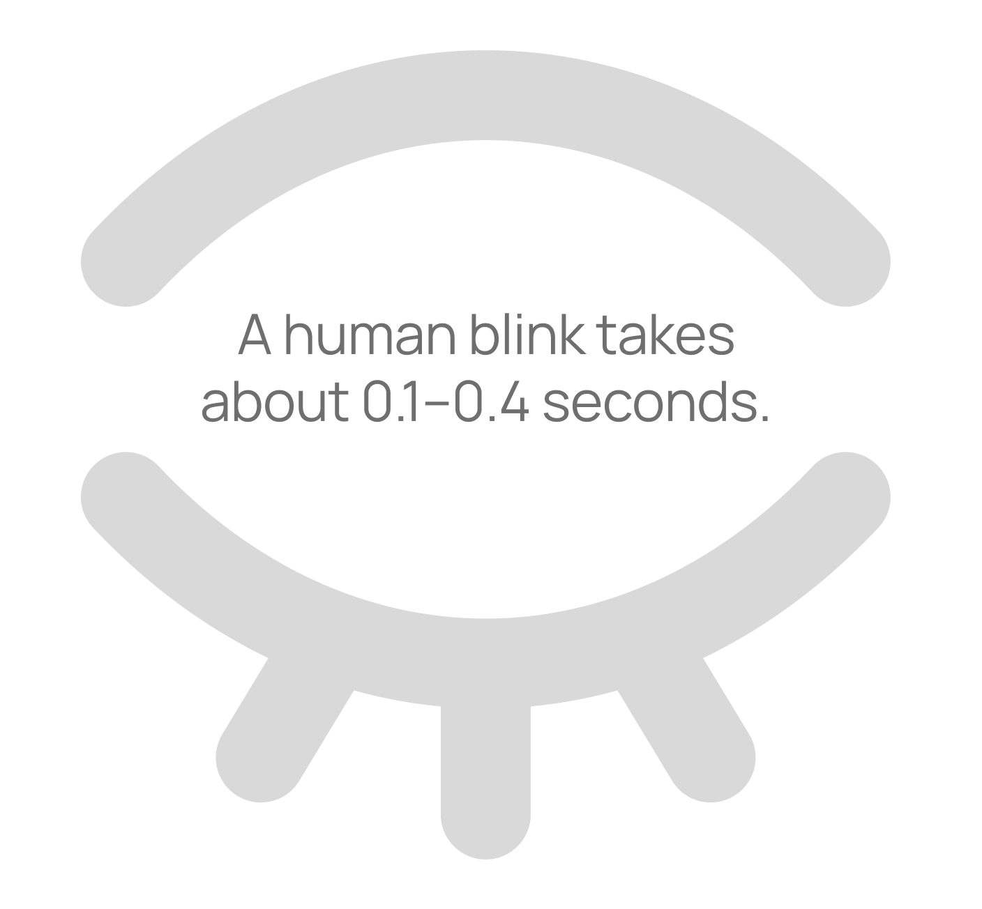
You've got just 0.2 seconds to make a killer first impression on your website visitors. That's according to a 2012 eye-tracking study from Missouri University of Science and Technology, where researchers found users form snap judgements in under two-tenths of a second. For context, a human blink takes between 0.1–0.4 seconds.
At a high level, eye-tracking works by using specialised software and an infrared camera to monitor where people's eyes dart across a screen to understand how exactly people take in information. In this study, participants viewed web pages while their eye movements were recorded, revealing how quickly they scanned and fixated on elements like logos or menus. It showed that after the initial blink-of-an-eye judgement, users spend about 2.6 seconds scanning before zeroing in on key areas. For businesses, this underlines why design matters – squander that initial impression and visitors will bounce before engaging.
These insights are gold for anyone tackling a website project. Here are some practical tips to optimise your site, capture attention, and convert browsers into leads. Some might seem obvious but they're easily forgotten:
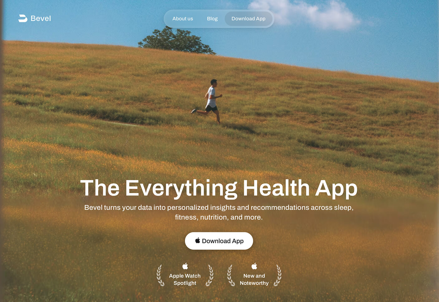
Nail your hero section
This is often the first fixation point, so make it hit with a clean, memorable logo that communicates your brand. The hero section – that top banner area – should feature a punchy headline and visuals that hook instantly. Clear copywriting is crucial here; ditch jargon for straightforward language that spells out the value you offer. For example, instead of "Innovative solutions for modern enterprises," try "Boost your sales with custom designs that convert." This clarity builds trust fast and guides visitors deeper into your site.
Streamline navigation
Keep menus simple and intuitive – no overwhelming drop-downs. Position them where eyes naturally land, like the top or side, to make exploration effortless and reduce frustration.
Use whitespace and contrast
Whitespace, or negative space, isn't just empty; it's a powerhouse for readability. Studies show it can boost comprehension by up to 20% by giving elements room to breathe, reducing cognitive overload, and making content scannable. For instance, compare a crammed page where text butts up against images – it's exhausting to read – versus one with generous margins and padding, where your eyes flow smoothly from headline to body text. Pair this with high contrast, like dark text on light backgrounds, to ensure everything pops without straining the eyes. This combo keeps users engaged longer and highlights key info.
Incorporate calls-to-action early
Place prominent buttons like "Book a Consultation" in high-visibility spots to nudge that initial interest into real action.
Choose imagery and a colour palette wisely
High-quality images that load quickly add visual punch without slowing things down – think relevant photos or graphics that support your message. For colour palettes, stick to 3-5 hues that align with your brand; warm tones like reds can evoke energy, while blues build trust. Ensure good contrast for accessibility (aim for at least 4.5:1 ratio for text) to avoid alienating users. General considerations: Test for mobile responsiveness, as colours can shift on different screens, and use imagery sparingly to avoid clutter – quality over quantity always wins.
These principles aren't just theory; they're proven to lift engagement and conversions. If you're building or revamping a site, tools like Webflow simplify creating responsive, SEO-optimised designs without heavy coding. I help ambitious businesses like yours succeed with design that converts visitors into leads — wherever they are.